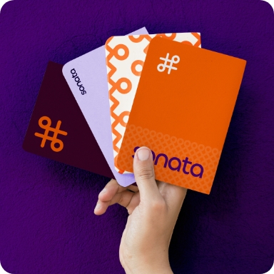
Visual Identity / Logos / Guidelines

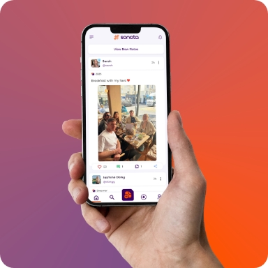
Sonata is a new social media platform created and owned by Matt Beck, pitched as an alternative to Twitter (X). It provides a Twitter style microblogging experience with a primary distinguishing feature: Amplification, which boosts or suppresses users and content based on how close they align with socially unacceptable or illegal content.
Its main difference to existing social platforms is its stance on AI, to protect and promote human creativity. Sonata champions and promotes real effort and real work as we enter a world of endless generated content. The platform is currently in public beta and aims to launch in 2026.
The challenge
Entering a crowded social media landscape, Sonata needed a visual identity that could stand apart from established giants, be instantly recognisable, legally trademarkable, and strong enough to carry a platform built on a bold philosophy.
The original brief was to initially avoid any visual link to musicality with Sonata being a musical term as defined as, ‘a composition for an instrumental soloist, often with a piano accompaniment, typically in several movements with one or more in sonata form.’
This definition, however, perfectly described Matt’s approach to the project, having created a minimum viable product that is self-funded and split into several planning phases: development, branding, user experience and deployment.



Our approach
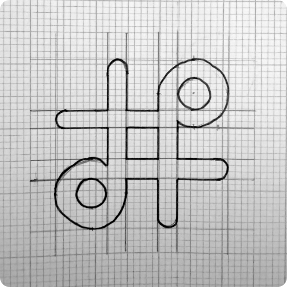
Once this restriction was lifted, we focused on creating a logo mark that visually represented ‘a place to sound your thoughts’. This opened up a world of concepts. Some of these concepts are shown above.
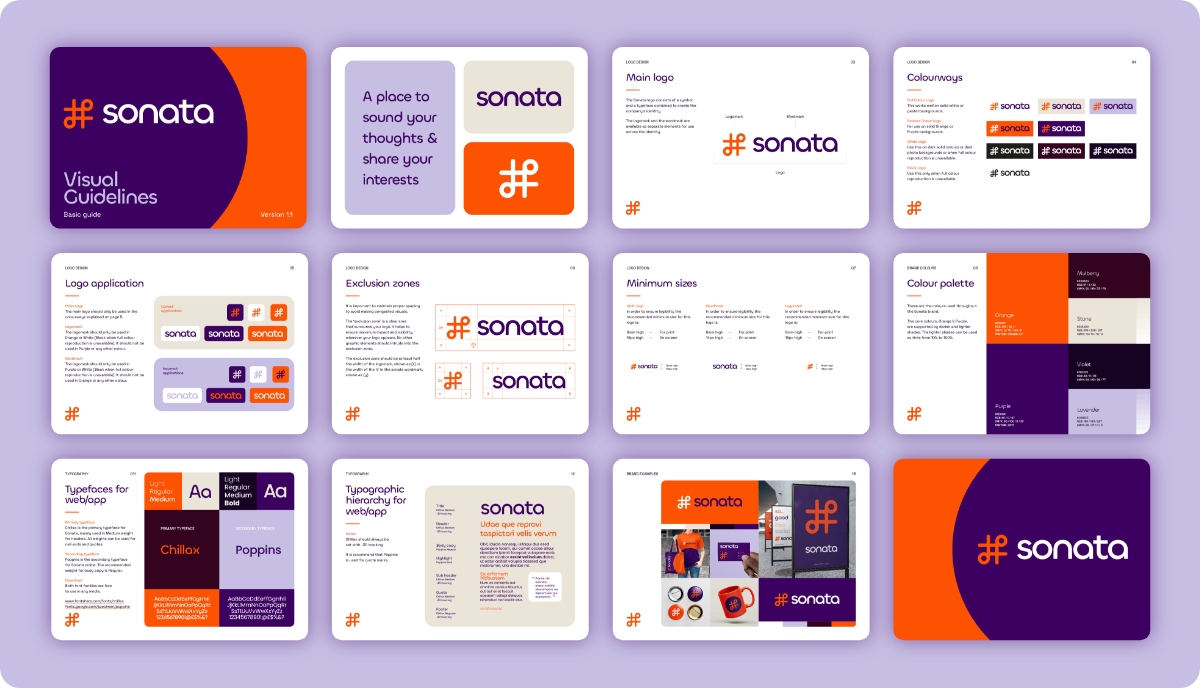
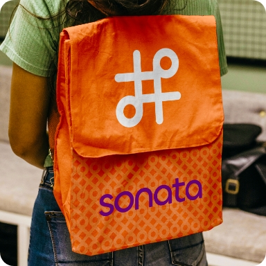
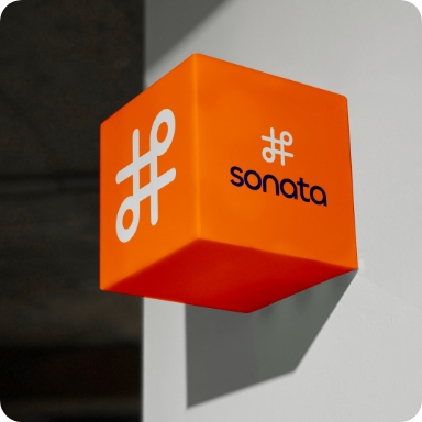
The lightning bolt moment came when we combined musical notes and the hashtag into one unified mark. Instantly recognisable, with a subtle nod to its musical name, this avoided anyone thinking that Sonata was exclusively for music.
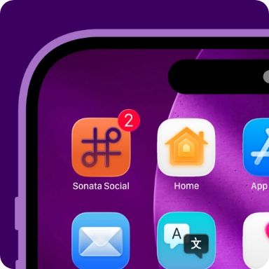
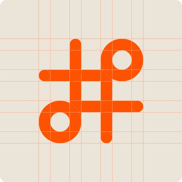
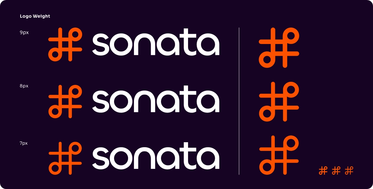
We ran some intellectual property and trademark research to ensure the logo mark was unique and could be registered without complication. Results came back clear, so the next step was to ensure the logo mark was pixel perfect and worked at all sizes, exploring weights to select the fit.
Paired with the logo mark is a modernist word mark with a harmony to the curves, matching the weight and notes of the logo mark.
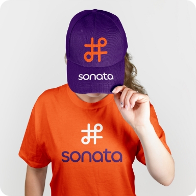
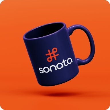
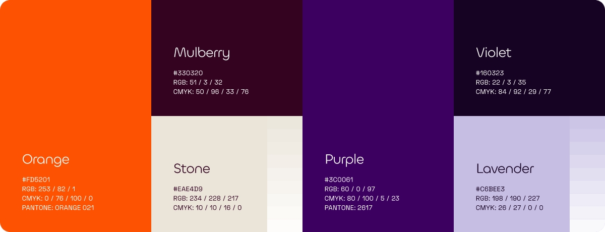
We purposely avoided existing colours used for social media platforms such as Twitter (X), Facebook, Instagram, LinkedIn, TikTok and Mastodon. It had to be brandable. This orange and purple combination with supporting dark and light hues works perfectly together, and we ensured its use was WCAG AA compliant.
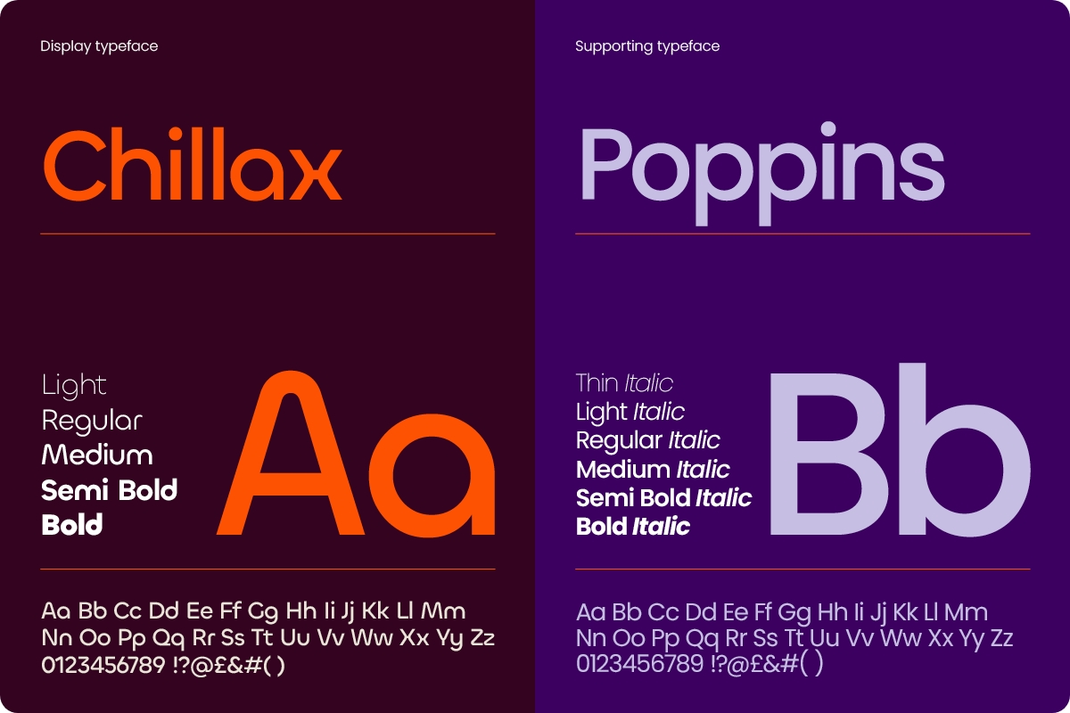
It was imperative that typographic choices had an open license, ensuring commercial use for all forms of media and supported a wide range of international languages. As Sonata is self-funded, these also needed to initially be free to use, as licensing for all forms of media can be wildly expensive. We selected two typefaces, both from the Indian Type Foundry, for these reasons.
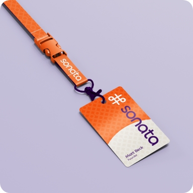
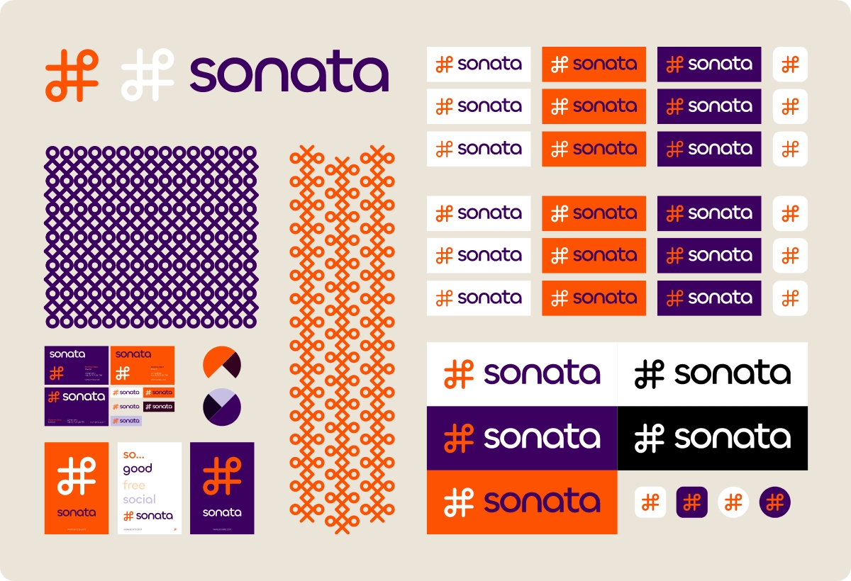
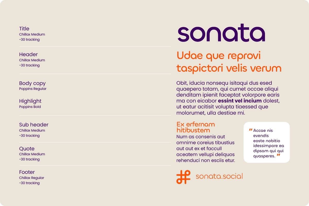
A set of visual guidelines were created to support the correct usage of the logo, colours and typography for the wider team and the production of the wider platform.
The result
The result is a trademark-cleared, WCAG AA compliant visual identity, built on open-licence typefaces, a unique logo mark, and a distinctive colour palette, ready to scale across a full development team and launch to market in 2026.
We are looking forward to the launch of this pro-human creativity, anti-GenAI platform and its unique stance on amplifying socially acceptable expression.